Written by Alex Ren
Updated on 12 min read
Is dark mode better for your eyes? The research says something more interesting than yes or no
Quick summary Dark mode feels kinder to the eyes, which is why almost everyone who spends their day at a screen has switched. The readability research, awkwardly, points the other way: in normal room lighting, light backgrounds measure better for acuity and for reading accuracy, and the studies that looked for a difference in eye fatigue did not find one. That does not make dark mode a mistake. It makes it a preference with a couple of genuine exceptions, and a distraction from the thing that is actually tiring your eyes.
In this article
- The short answer
- What the research actually found
- So why does dark mode feel so much better?
- The case against dark mode nobody mentions: astigmatism and halation
- Who dark mode genuinely helps
- Is grayscale better for your eyes?
- What actually changes how your eyes feel
- One open question: the long-term picture
- When to get your eyes checked instead
- Frequently asked questions
The short answer#
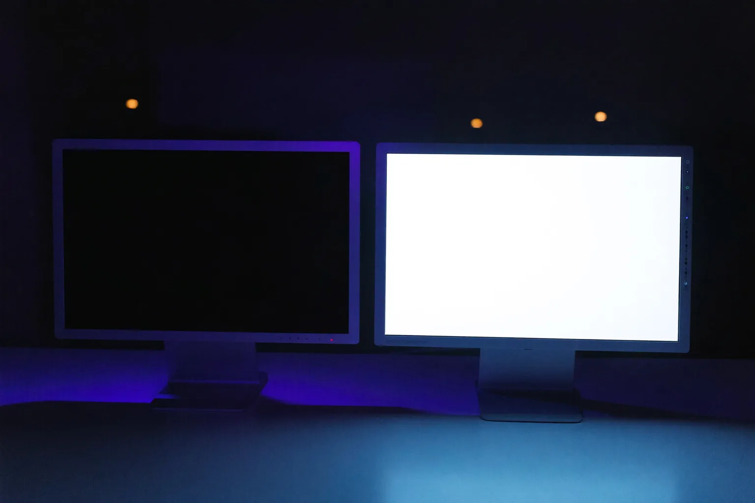
For most people with normal or corrected vision, working in a normally lit room: no, dark mode is not better for your eyes, and it is very slightly worse for reading small text. In a dark room at night, dark mode is more comfortable because it is less glaring, which is a real benefit even though it is about the room rather than about your eyes. And for a minority with specific conditions, dark mode is meaningfully better. None of these effects are anywhere near as large as how long you have gone without blinking properly or looking away.
What the research actually found#
The technical term for this is contrast polarity: positive polarity is dark text on a light background (light mode), negative polarity is light text on a dark background (dark mode). It has been studied since the days of CRT terminals, and Nielsen Norman Group's review of that literature is the clearest summary of where it landed.
- Piepenbrock and colleagues (2013) tested visual acuity and proofreading across age groups. Light mode won on both, at every age. The advantage grew as the font got smaller, which is the case that matters for anyone reading code or spreadsheets.
- The same study looked specifically for fatigue and found no significant effect of contrast polarity on any of its fatigue measures. This is the important one: the entire premise of dark mode as an eye-health choice is a claim that measurement has not supported.
- Dobres and colleagues at MIT (2017) tested glanceable reading. During the day there was no significant polarity effect at all; at night, light mode performed better, particularly at smaller sizes.
- Participants could not tell. In the readability work, people's performance was better in light mode while their subjective sense of readability showed no difference. What dark mode reliably improves is how using the screen feels, not how well your eyes do the job.
The mechanism behind the light-mode advantage is your pupil. A brighter field constricts it, and a smaller pupil increases depth of field and reduces the effect of the eye's optical aberrations, so the text lands more sharply on the retina with less focusing work. A dark screen opens the pupil back up and gives you a slightly softer image.

So why does dark mode feel so much better?#
Because most of the time you are not comparing dark mode to light mode. You are comparing a screen that matches the room to a screen that does not. A white page at full brightness in a dim evening room is a small lamp pointed at your face, and switching to dark mode fixes that in one click. Turning the brightness down would fix it too, and would keep the readability advantage, but nobody does that because it is two clicks deeper in the settings.
This is why the honest advice is not a theme, it is a rule: match your screen to the light in the room, and change it when the room changes. Bright room, bright screen, light mode. Dark room at night, dimmer screen, and dark mode is a perfectly reasonable way to get there. The American Optometric Association's guidance on computer vision syndrome puts screen and ambient lighting in the same category for the same reason: it is the mismatch, not the colour scheme, that strains.
The case against dark mode nobody mentions: astigmatism and halation#
If white text on a dark background looks slightly smeared or glowing to you, that is not your screen. It is halation, and it is common enough to matter: some degree of astigmatism is present in a large share of adults. Astigmatism means the cornea is not evenly curved, so light entering at different points focuses differently. On a dark background your pupil opens wider, more of that unevenly refracting periphery is in play, and bright letters bleed into halos.
The result is that light text on black is harder to read for a big minority of people, who often assume everyone sees the same slightly fuzzy glow and that they simply need to concentrate harder. Accessibility guidance on astigmatism covers this in detail. A practical test: open the same page in both modes and read a paragraph of small text in each. If the dark version feels like it needs a squint, you have your answer, and it is worth checking your prescription is current.
If you like dark mode and this describes you, the fix is usually not going back to white. Use a dark grey background rather than pure black, off-white rather than pure white text, and a slightly heavier font weight. Maximum contrast is what produces the glow.
Who dark mode genuinely helps#
The research does not say dark mode is useless. It says the benefit is concentrated in specific groups rather than spread across everyone:
- People with cloudy ocular media, including cataracts. Legge's classic work found better reading rates with dark backgrounds in this group, because a bright field scatters inside the eye and washes out contrast.
- People with light sensitivity, whether from migraine, concussion recovery or medication. Less emitted light is straightforwardly less provocation.
- Anyone working in a genuinely dark room, where the alternative is a glaring white page.
- People who find it easier to focus on a dark interface. Not an eye benefit, but a real one, and there is no reason to argue with it.
Notably, central-vision impairments showed no polarity effect in that work, so this is not a general low-vision recommendation either. It is specific.
Is grayscale better for your eyes?#
For your eyes specifically, no. Removing colour does not change the two things that actually drive screen eye strain, which are a collapsed blink rate and hours of sustained near focus. Your eyes are not tired because the interface was blue.
But grayscale turns out to be one of the few interventions in this whole field with real trial evidence behind it, just for a different outcome. A study in The Social Science Journal found that setting phones to grayscale cut screen time by nearly 40 minutes a day, concentrated in social media and browsing. A 2024 study in Mobile Media & Communication replicated the effect at 22 to 50 minutes a day and found it also improved people's sense of control over their phone use and reduced perceived overuse, while leaving productivity and sleep quality unchanged.
The mechanism is motivational, not optical: a grey feed is simply less rewarding to look at, so you put the phone down sooner. Which makes grayscale a genuinely good tool if your problem is screen time creeping up, and the wrong tool if your problem is burning eyes at the end of the day.
| Setting | Good for | Not the answer for |
|---|---|---|
| Light mode | Reading accuracy and small text, in a normally lit room | Working in a dark room at full brightness |
| Dark mode | Dark rooms, light sensitivity, cataracts and cloudy media | Eye strain in a bright office, small-text readability |
| Grayscale | Cutting phone screen time, 20 to 50 minutes a day in trials | Tired, dry or aching eyes |
| Matching brightness to the room | Nearly everyone, at no cost, in either mode | Nothing, this is the one to actually do |
| Breaks and blinking | The mechanism behind screen eye strain itself | Nothing, this is where the real effect is |
What actually changes how your eyes feel#
Here is the uncomfortable proportion at the heart of this article. Switching themes moves your reading performance by a few percent. Not blinking properly for two hours moves how your eyes feel by considerably more than that. At a screen your blink rate drops by roughly half and many of the remaining blinks are incomplete, so the tear film thins out and the surface gets irritated, while your focusing muscles hold near distance without a break.
Which is why the fixes that work are unglamorous and have nothing to do with your colour scheme: the 20-20-20 rule to break near focus, deliberate full blinks, screen at arm's length with the top at eye level, and lighting that matches the room. The full list is in how to reduce eye strain, and if your eyes feel heavy rather than strained, the causes are worth separating out before you change anything.

One open question: the long-term picture#
There is an interesting complication worth knowing about, and worth not overreading. Work by Aleman and colleagues in 2018 found that sustained reading in light mode was associated with choroid thinning, a signal associated with myopia progression, while dark mode showed the opposite pattern. That is a mechanistic finding on short exposures, not evidence that light mode will make you short-sighted, and it does not overturn the readability results above. It is a reason to hold the light-mode advantage loosely rather than to switch on the strength of it.
For now the practical position stands: use whichever mode you prefer, match the brightness to the room, avoid pure white on pure black if text glows for you, and put your effort into breaks rather than themes.
When to get your eyes checked instead#
If you are experimenting with themes because your eyes hurt, the theme is not the investigation you need. Book an eye test if:
- Text glows, smears or doubles in either mode, which can indicate uncorrected astigmatism or another refractive error.
- You get headaches that reliably follow screen work.
- Blurred vision does not clear when you blink or look into the distance.
- Discomfort persists despite regular breaks, a decent setup and matched lighting.
- You have not had a test in two years, which is the most likely single explanation for screen discomfort in an adult who is otherwise doing everything right.
Frequently asked questions
Is dark mode better for your eyes?
Does dark mode reduce eye strain?
Why does dark mode feel easier on my eyes then?
Is dark mode bad for astigmatism?
Is grayscale better for your eyes?
Which is better for reading small text, dark mode or light mode?
Sources & further reading
- Nielsen Norman Group: Dark mode vs. light mode, which is better?
- American Optometric Association: Computer vision syndrome
- Level Access: Accessibility for people with astigmatism
- Holte & Ferraro (2020): True colors, grayscale setting reduces screen time in college students
- Dekker & Baumgartner (2024): The efficacy of a grayscale smartphone intervention addressing digital well-being
- Nature Scientific Reports (2023): Prevalence of digital eye strain, meta-analysis
- American Academy of Ophthalmology: Computers, digital devices and eye strain
- W3C: Understanding WCAG 2.2 minimum contrast